A director's commentary or an audio commentary is an audio track consisting of a lecture or comments by one or more speakers, that plays in real time with video. Commentaries can be serious or entertaining in nature, and can add information which otherwise would not be disclosed to audience members. Audio commentary can be used over the top of many different media, most commonly used in TV series box sets, music video's and sections of films. Usually a seperate feature often found in bonus material of DVD's. These tracks will contain dialogue and sound of the movie, during the dialouge the volume of the movie will be temporarily turned down. The two main types of audio commentary are Partial or scene-specificand Feature-length or screen-specific commentaries. These differ through length of commentary rather than the type of content. However, 'Partial or scene-specific' can sometimes be recorded without the speaker viewing the film and thus the commentator may make more general comments than pointing out specific details. And 'Feature-length or screen-specific' commentaries are recorded in one session: the speaker or speakers watch the movie from beginning to end and give their thoughts directly based on what is happening on-screen. Usually the director will take part as one of the speakers and reveal how he achieved the current shot showing on screen or alternatively an actor/artist will describe how they achieved their performance. Sometimes the speaker will get someone else (to act as an audience member) to ask him certain questions that he can answer during the audio commentary.
Here are some examples of audio commentary over music video's:
- This is a perfect example of an audio commentary used to explain how exactly the director achieved some shots. The group/artist explain what the song is supposed to be about. But mainly they all are trying to be funny and give their fans a little bit of an extra insight into their group.
- This is just a single speaker audio commentary that goes over the whole track.
- Some audio commentaries are created purely to be funny and entertaining.
Here are some examples of audio commentary for TV series':
- Commentary by actor Neil Flynn talking about co-worker
- Commentary by the cast describing the scene in an entertaining nature.
DEFINITION: A Director's Commentary is a descriptive account from the director of a perfomance/ produced product as it happens or has taken place and an opportunity for them to look back and take into considerartion the glory of hindsite and see what has gone well, maybe not so well and possible improvements for future productions.
TWO TYPES: Partial or scene-specific - which only covers selected scenes of the film. Sometimes these are recorded without the speaker viewing the film and thus the commentator may make more general comments than pointing out specific details.
Feature-length or screen-specific - which is recorded in one session: the speakers watch the movie from beginning to end and give their thoughts directly based on what is happening on-screen.
FORMATS: Most audio commentary is used in films and movies, however they often are used with music video's too. There have also been some video games which have added bonus commentary to the game.
The commentary does not have to be done by the director - some have been done with cast members, writers and producers as well as critics, historians and fans. There have also been commentaries by actors in character - perhaps to make the commentary more entertaining and enjoyable.
EXAMPLES:
This Rise Against music video uses scene specific commentary by the director. We see the director being filmed and talking about the certain pieces of the video which he used to display the meaning of the song. We also see how the band filmed their part of the video from a different perpsective.
This is similar to the Rise Against commentary, however it uses a variety of people - director, artist and photographer. Although this isn't seen as a commentary, and is made by MTV, it still shows how all of these people came together using different ideas to create the PULP video.
This is an example of a feature lenght commentary, however it seems like the commentary is done to be slightly entertaining. The voices seem to match the quirky nature of the video and the band itself, and i feel that the way that it is produced makes the video alot more interesting and enjoyable to watch and listen to.
"On disc-based video formats, an audio commentary is an additional audio track consisting of a lecture or comments by one or more speakers, that plays in real time with video. Commentaries can be serious or entertaining in nature, and can add information which otherwise would not be disclosed to audience members."
The DVD medium allows multiple audio tracks for each video program. DVD players usually allow these to be selected by the viewer from the main menu of the DVD or using the remote. These tracks will contain dialogue and sound of the movie, often with alternative tracks featuring different language dialogue, or various types of audio encoding (such as Dolby Digital, DTS or PCM). Among them may be at least one commentary track.
There are several different types of commentary. The two main types simply define the length of the commentary rather than the type of content. They are:
Partial or scene-specific, which only covers selected scenes of the film. Sometimes these are recorded without the speaker viewing the film and thus the commentator may make more general comments than pointing out specific details.
Feature-length or screen-specific, which is recorded in one session: the speakers watch the movie from beginning to end and give their thoughts directly based on what is happening on-screen.
Typically a commentary track will include feature-length commentary from the film's director, cast members, or occasionally writers and producers. Occasionally actors will perform commentary in-character. (In recording sessions with multiple speakers, a designated moderator may encourage the discussion flow,) Some DVDs include outsider commentary performed by film critics, historians, scholars or fans. In more elaborate productions, multiple speakers from various recording sessions may be edited together for a single audio program.
Some DVDs feature commentaries with on-screen video enhancements, such as telestrator prompts, (allowing the director or commentator to "draw" on the screen, pointing out specific details), or theGhostbusters "video commentary", where one of the subtitle tracks is used to add silhouettes of the speakers in a manner where they seem to be in a theater commenting on the movie as it was screened for them in the style of Mystery Science Theater 3000. Less common are actual video commentaries, showing the speakers as they are recording the commentary, requiring separate video tracks.
The video to 'Drop' by The Pharcyde as well as the making of/video commentary by Director of the video Spike Jonze.
The official video to 'Fell in love with a girl' by the White Stripes followed by the making of the Video featuring interviews with the band and video Director Michel Gondry.
The official video to 'All is full of love' by Bjork accompanied by the making of the video featuring interviews with the artist herself and video director Chris Cunningham.
The video to Jamiroquai's 'Virtual Insanity' followed by the making of, featuring and interview with the Video Director Jonathan Glazer.
The official video to Jay Z's '99 Problems' as well as the making of/director's commentary featuring interviews with the artist himself, crew and the video director Mark Romanek.
The brief given to us was to create a theme for all of our ancillary products, rather than using screen shots and cuts from our music video. After looking at Madonnas "Music" album, single and digipak, it became clear that we needed to create a strong theme from the video to use it as a more effective advertising campaign.
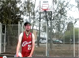
Our main idea before this was to use a screen grab of the first shot in our video, with Steve in the court with a basketball and the hoop in the background. We are now biasing our ideas on the theme of a basketball. We feel that this will be a strong, iconic object to use in all our products, and it could mean that whenever this object is seen, the audience will instantly think of Kyle Rapps.
We have a number of ideas for this theme for our Digipak Covers - these all involve a seperate photo shoot which we are going to complete next lesson.
Idea for back cover
1) We have an idea of just the basketball sitting in the middle of a court for our front cover. The colours will be emphasised with the editing on Photoshop, and we could possibly get a shot with sunlight creating a shadow on one side of the basketball - obviously this will be weather permitting. We plan to get a fairly close up shot of the ball, so we can write the name of the album on the side of the ball when editing it. Another idea is to get the hoop in the background - obviously the framing of the shot will need to be very low to create this effect. We will then take a frame of the iconic basketball and Clevland Cavilier basketball shirt on a hanger in the changing rooms for the back cover with all of the track listings around it.
Idea for Disc Cover
2) Our second idea is to have a shot of Steve waist up with his iconic basketball jersey and basketball under his arm or in his hand. We will then take exactly the same frame, but from behind him to use as the back cover for the digipak. Of course we will have to be very careful to make sure the frames are exactly the same, otherwise the cover will not look very effective and continuity would fall. We would then use a basketball to cover the disc in the Digipak as the ball is circular like the disc. This would add the iconic object into the design well.
Nike High Top Basketball Trainers
3) The final concept we have for the front cover is to take a shot of the back of some high top Nike trainers and a basketball next to the pair of shoes. We plan to either shoot this in the sports hall, to get a feel of the wooden flooring. Or we could possibly take a shot of them underneath a bench - rather like the idea used in concept 2. The only slight problem with this is that Steve didnt wear Nike trainers in the video - this could ruin the iconic object slightly.
For our Magazine Advert we are still going ahead with the idea of Steve on the basketball court, in costume, with the the iconic basketball and most likely the hoop in the background. We feel that the magazine ad needs to show the audiences more about the artist than the Digipak does. We want to engage the reader and for them to associate the basketball, jersey and court with the artist we are promoting. We also feel we can then write the information on the location background around him and this would look very effective.
Below is an image I drew for rough idea for our magazine advert. We decided on using an image of the artist on the cover, wearing one of the first costumes you see them in, in the video. The layout has to make our artist stand out, so we came up with the idea of the artist standing in front of the title, or it being above him. The release date and and the name of the artist, as well as the record label will be down the right side, as all three are some of the main background of the information about the artist. Down the left will be the reviews. And directly underneath at the bottom will be web addresses and links to the websites associated.
Although this is a CD Cover, not a Digipak, as a group we will be able to take a lot of inspiration and ideas from this example. As you can see there is a theme of smoke in the product. The album is called "Rolling Papers" and therefore the smoke theme is in relation to the name. The green colour is used throghout the product which adds a great effect, and the fact that Wiz Khalifa's face is the only recognisable thing on the front cover, the audience will know (without looking at the title) that is is the artist.
The product is very simple and iconic and I think that our group can take away the idea of using simple ideas and iconic objects and themes running through the products.
We can see that the list of songs at the bottom are not seen to be as important as the logo of Wiz Khalifa. This is probably because the product is trying to promote the name and face of Wiz Khalifa, rather than the songs. Hopefully, the product will then make consumers recognise the artist more frequently - possibly leading to more purchases of future prodcuts.
Overall, this proffessional CD cover is very simple yet effective, and we should note that the visuals are more important usually than the information such as track listing's and production notes on the back cover.
For our magazine advert we are going to use similar colours and tones to the ones in the music video.
The most common colours we use in the video are Red, Black, Blue, White and Grey We decided that because these were the most common colours in our music video, we would use these for our digipack. We may use an image like the above one with Steve holding the Basketball wearing the Red and Black vest top. This means we are going to take similar colours out to use for our text and symbols etc.
This is a great example of a professional magazine advert which is of a more related genre to our genre of music. Obviously this theme is of glamour and uses a lot more colour than the student advert that I analysed. You can see because Cee Lo Green is a solo artist, they have used a close up of him to make the artist instantly recognisable when the advert is seen. This means that the title of the artist is less important, and consequently does not have to be at the top of the page. The bottom third of the page then tells us the information we need and it follows the conventions used in the student ad:
You can see that the editing and colours used help this advert stand out from the page. They have used very strong, vibrant colours (perhaps to link with the genre of pop/soul/rap) with the writing and background, as well as using strong bright lighting in the phot to reflect of his jewellery.
Again this is a very simple advert that is instantly effective and memorable. It is very useful to see how different genres are shown through the adverts and this real ad will definitely aid our designing and editing for our magazine ad and digipak.
This Student Magazine Ad used the theme of Graffiti - which was also the theme for their Music Video and Digipak. Obviously the location is the most important part in this magazine advert - as it represents the music video done by the artist. It would be a good idea for us to use a location from our music video - creating a recurring theme throughout our products - so then the audiences who have seen one part of our product they will instantly recognise that it is a certain artist. It would have been easy for the magazine advert to have had graffiti font, instead of using a derelict building with graffiti in the background, however the neat and simple font works well. Using simple font will make sure the audience can quickly grab the artist and song name at first sight of the page. The fact that the shadows at the top of bottom of the page make the font stand out more is clever and also creates a more eerie feel to the location shown. Obviously the font colour of white was an easy choice as it stands out the audience can read it.
You notice that the title of the artist and song name are at the top, as this will be the first thing that the audience will read. The next most important piece of information on the advert is the date of release and where it can be brought from. Therefore it was important this was placed near the top, under the title so that it can be read easily. The more "unimportant" pieces of information have then been placed below, such as the reviews and record labels etc. These pieces of information will probably be read by the audiences who are interested in the band and want to find out more information to see if it's worth buying.
Overall, this is a perfect example of a simple but effective magazine advert. We could use the idea of a location from our video in the magazine advert, however because this is by a band it may not be as necessary to visually show the faces of the band. Because our song is done by one artist and is a different genre to this, it may be more sensible to show the audiences who "Kyle Rapps" is. We can definitely take some good ideas of how to position texts in the magazine ad though.
Our deadline for the two Ancillary Products (Digipak and Promotion Magazine Ad) is the last lesson of the week 25th November. This means we have little time to think about what theme we are going to base the products around, and then produce them. We have thought that we could definitely use screen grabs from the video we have created. There are very good shots from the basketball court with Steve and Reece and we think that it would be a nice idea to use basketball as the main theme to our products. Shots such as when Steve is on the step with a basketball or when they are both playing basketball, could be a very simple but clever shot to use as a front page of a digipak or a magazine ad. We have considered the possibility of doing a separate photo shoot for the products, however you will have to take into the considerations of the weather (if we want to film outside), finding the costumes we used in the filming and finding the right photo to use. We have a lot of strong shots in the video, therefore it would definitely be best to use the shots we have already gathered. Photo shop will allow us to edit the photo's to a professional level and this will mean we can create an urban look to our screen grabs.
After editing further after our rough cut and adding more shots we filmed on Thursday, we then got feedback from Amar (who is a professional music video producer) and Andria (our media teacher). They were highly impressed with most of the lip-sycning - mainly the first part of the video - however they felt because Steve's great lipsyncing, the second artists part is slightly outshone. We were told to try and pick out the best lines from Reece's part to use and then use cutaway's for the parts of the verse that aren't as good. At the beginning Amar felt that there should be a short cutaway before Steve started rapping to make the beginning more involved and engaging - we will make sure we do add something in here.
We were given credit for the walking and rapping we used in the video - however it was felt that there was not enough of this. We will be looking through our footage to find more shots like this as they are seen to make the video look less simple. The pace of the editing was good, however they also felt that some of the shots needed to be tweaked to make sure the lip-syncing (especially in the third verse) was as good as it could be.
Finally we all thought that effects and filters could be added to make the video look more urban. Although we were praised for our use of costumes, props and locations to create and urban look, it was still felt that to make the piece more professional that filters and effects should be added. We have decided to add these in right at the end, when we have finished all of the editing of the shots.
After finding out that it was likely to rain after 4PM when we had rented out the camera, we had to make sure we had a back up plan to our action plan. We managed to get some good shots when the sun was heading down and the street lighting came on - with a close up by garages for the second artists part. We felt this was fairly urban and could be used in the video if the lip syncing was good enough. We also began to film perhaps "random" but needed footage such as cars passing by, locations we had used and signs - which we may need because we were lacking cutaways. It did begin to rain heavily after shooting some shots, so we then went to Cineworld down Hills Road and filmed a shot of the main artists in the arcade (this linked in with a line in the song) and then we went to the big multi story car park - in which we found an empty level.
We then decided to use this as a regular location in our video and myself and Steve delivered our verses in various forms - walking, sitting down and in a window reflection. We feel this variety of shots will enhance our video and mean that we will not be relying on the three locations we already had. We used this location to also film certain lines and parts of verses which we feel we did not successfully lip sync in our first shoot. The car park was extremely urban and we felt we had responed well to the ideas and critisim that was given to us by our peers.
Overall this second shoot was required and we feel when editing now, we have a great variety of shots to choose from and lots of cutaways we can add aswell to make our video more engaging.
After both positive feedback and some constructive criticism, we feel this peer review will definitely help us improve our music video greatly. Firstly due to the "excellent" lip syncing in the first section of the video, many felt that the second half needed to be improved or perhaps redone. We all feel that this is the case and we will be re-filming the second artists part of the song, to make sure the lip syncing is as good as the first artist. We were also slightly criticised for our use of plain shots such as mid shots. Therefore we will most likely have to film a greater variety of shots for both artists - for example using side shots, close ups and possibly zoom ins from the camera.
For the editing of our film, we were told to try and make the video seem more "urban'. It was suggested to use lighting or the editing software to saturate the video. We feel that we could possibly try to use the software to create a more visual edit - or perhaps film at night, maybe under street lights, to add a good effect.
Another idea raised was the use of shots without rapping, to break up all of the lip syncing shots. This will make the video more engaging and will create a more proffessional piece of work.
We are planning to film in next Thursdays lesson (3rd Nov) and then at night. We will then be filming a variety of shots on the basketball court - with both artists and then some street shots at dusk/night to create a more urban effect. We will be bringing a different costume for the street view and may have to take into account lighting when filming in the dark.
We feel there wasn't enough use of props. Therefore, when we next film we'll try to bring in more props that relate to our genre, eg: skateboard n' cigarettes etc