1. For our product we we analysed and researched other products with a similar genre. We looked at other music videos under the same conventions and followed Goodwins theory. One of the videos we looked at was 'Lil-Wayne - Lollipop' which is also under the hip hop/ rap genre. Here we focused on settings and costume etc to get ideas for our video. We decided to some conventions by styling our main singer in a 90's fashion/basketball style theme, we plated around with the idea of pitting our characters in a conventional urban setting, keeping the basketball theme. We also looked at a lot of editing and cinematography techniques and kept our character in most of the shots rapping directly at the camera then cutting back to the other shots to break it up. The editing techniques with hip hop videos change a lot so we decided on one of the more effective techniques and did quick cuts and fades on some of the cut aways depending on the speed. conventions are usually that the visuals and lyrics work well together, work well and fit with what's on screen, this is what we aimed to do.We challenged the conventions slightly as the main character in our video wasn't as 'glamourous' as some of the rappers in the music videos we analysed, though we still had various costume changes and references to money.
2.Our music video, digipak and magazine advert work well together to sell the style and image of our artist. The three products together are aimed to show what the artist is about and puts across the genre and style. We focused more on the music than the artist in our final products. The concept in the music video was to sell the artists image, meaning we had him in the shots more than anything else. Whereas the digipak was there to put across the style, we did this by referencing ket themes from the music video like the basketball and the red shirt. Kyle Rapps being an underground artist we planned to put this across in the digipak by not showing his face but picking out key themes and colours instead. Our target audience follows the same set ideas as Kyle Rapps, most of his videos fir around schools and colleges and the locations show this as they are usually college and libraries, schoolyard and halls. a lot of his lyrics fit with this conventions by filming in the college basketball court and breaking it up with other things like parking lots etc. I think this would attract the younger target audience we were aiming for as they can relate.
3.The audience feedback was positive mostly, it showed us that our synchronizing of the video worked well and matched the mouth movement. another positive was that the genre came across well throughout the costume and locations and the settings plus the hand and body movements helped make the lyrics clear to the audience. the pace of out video also worked well with the lyrics, the amount of cuts were at the correct pace, though we could have improved the parts with both Reece and Steve by cutting away to more things.This is an improvement to our rough cut feedback, as we corrected the lip syncing that was slightly off, we also added more cut aways to make the pacing quicker, we took the advice about sharpening our footage with video filters and colour correctors. we also experimented with fading, bring one shot from behind then fading it out again. Although our video was improved we could have done more walking shots to make it less simple and re-shot Reeces part near the end.
4.The first thing we did for this was research, we did all of it using 'Apple Mac's' in the classroom with the internet and Blogger to take down our research and ideas. This was useful as it was easy to keep track of everything in one place. We then used the still camera to photograph our planning forms and sketches as to upload them to the blog to make it easier to look back at them. Once we had planned , we shot the footage using HD cameras, this allowed us to get good footage for our product. These were easy to upload onto the computer and insert into the programme 'Final cut' where we did all our editing. Although the software was effective and gave us a lot of potential we sometimes found it hard to use or didn't know how to get the effect we were after, this meant a lot of time was wasted playing around with the software. Syncing took the longest to do. One of the other software's we used was Photoshop which allowed us to manipulate the photos we took using a NIKON camera, it was easy to open up the images into Photoshop though using it on a mac was harder than i was used to as the positioning of the editing tools was different. We also created our digipak and magazine advert in Photoshop using templates which made it a lot easier, you can move around text and images a lot easer than most other softwares. Overall I think we did well with the technology we used and the products looked as good as we wanted them to.
Thursday, 15 December 2011

Storyboard changes (recap)
At the start we created a story board with details of the shots we were going to do as well as rough timings and locations we were going to shoot in. I feel that we followed this plan of action really well while doing our filming and editing. We kept the same basic structure, using the locations of the basketball court, the bank, arcade, skate parks and streets. We used these all the way through the video and cut to the different locations to keep our video interesting. We also kept some of the costume the same, as we roughly planned that he would be wearing a basketball shirt with a cap. What we did change was the order some of the shots were done in, we also added a lot more shots than we had planned, for example the shots in the parking lot were used as extra. We also didn't use background dancers in the end, as we decided it would look better just having the main rappers, we hadn't planned separate shots for the second rapper but worked this into the shoot. We also had Steve a lone in a lot of the shots instead of having other people playing basketball behind him, or skating and riding BMX's behind him in the skate park. Overall I think we kept a lot of our main ideas the same. But improved parts that needed more detail.
Saturday, 3 December 2011
Timed Evaluation (LYDIA)
Question One: In what way do your media product use, develop or challenge forms and conventions of real media products?
I believe that our media product develops and uses conventions of the hip-hop/rap genre of our chosen track. This is achieved through the use of sportswear; such as the tracksuit bottoms, basketball vest and skate shoes our main artist Steve dressed in especially for the video shoot. We as a group decided that the video should have an 'old school', urban feel to it to play to the conventions of the hip-hop genre. The use of the reference of sports brands, teams and sports in general as well as urban settings appear almost constantly in hip-hop/rap videos so as a group we agreed that this would be a key feature to base the concept of our music video around, thus deciding to film on a basketball court in college to keep the simplistic and raw feel we believed essential for the track. The basketball court located on the college site proved really effective as it was aged and simple, allowing focus on our artist we also felt fitting to the genre and the track we chose as this focus also appeared consistently in the videos of the same genre we used for research.
We found through analyzing real, professional music marketing products such as magazine adverts and tour posters that a lot of artists specializing in this genre use images of themselves to promote their work/products. We discussed these factors as a group and decided we could use this to keep in time with the conventions of the genre. However; as the original artist of the track was not included in the more mainstream music industry and was considered to be more of an underground artist, we didn't feel that we wanted to rely solely on an image of our artist, so decided to also advertise using props included in the video that we felt were key in creating the setting for our chosen track and the video supporting it, for example; the basketball, the red basketball vest that Steve appears in and the skate shoes he was dressed in during the filming of the video as they also help link the main product to the digipak and magazine advert.
Question Two: How effective is the combination of your main product and ancillary texts?
I feel that all three products work very well as a promotional package due to the use of props featured in the video and the colour schemes used as they tie the package together. I believe we have made it clear that both the ancillary texts are promoting the same product/artist as well due to the colours that have been carefully chosen to tie all three products together nicely.
The concept we were trying to communicate was that of a simple and un-materialistic nature, which also played to the fact that the original artist, Kyle Rapps, is seen as underground and not mainstream. We didn't want our video to seem like it was an extortionate amount of money to produce or that we wanted our artist to seem like 'the big man' or 'alpha male' as often depicted in many videos of this genre. As a group we decided that to us, the track was reminiscent of 'the old days' and i also believe it tells of how commercial the world has become. Upon realizing this, we decided we wanted the video and the ancillary texts to create the simplistic feel that tell parts of the story communicated through the track and its video.
These products create the feel that the artist is carefree, reminiscent and un-materialistic through the use of sports clothing with not a lot of intertextuality to expensive, commercial brands that are featured in many videos of this same genre. Throughout the video, the artist is seen in baggy/scruffy 'comfy clothes', and frequent over the top use of 'bling', 'ice' or diamond jewelry is scarce. Women are often objectified in hip-hop /rap videos and made to appear as another form of materialistic possessions. We challenged the convention of the genre by not including this in our main product as this was irrelevant to our concept. The scarcity of materialistic possessions also help to support the nature of our artist.
Having revised the above points, the products attract the target audience through the ability to offer something different/refreshing change, but still keep in time with a majority of the other conventions we as a group recognised of the genre mentioned in the first question.
Question Three: What have you learned from your audience feedback?
The initial pitch proved to be promising although obviously there were factors we needed to consider/reconsider. Such as costume and location, which, when revised, proved very effective. We also had the idea of having the artist walking and rapping throughout the video in different locations doing different things however; audience feedback informed us that that could have become boring and monotonous. We decided to have this feature as one shot as opposed to throughout the whole of our main product.
The rough cut proved very successful and audience feedback seemed to be mostly positive although the biggest disadvantage was the faltering of the lip-syncing towards the end of the track by the second artist. Reece found it really quite difficult to learn the lyrics to his part of the track and was disadvantaged by the fact that his part was a lot faster paced than Steve's. As Reece was the only other male team member and the part of the second artist was male, we decided that there was no other alternative than to find a way around it. We decided to resolve the issue by cutting in/away to as many clips that we had that worked well within the video, to take the focus away from the clips where the lip-syncing wasn't quite as strong. We feel our solution has helped strengthen our main product. We also got told that we needed better framework/variety of shots so decided to ad more of these in. instead of filming these shots all over again we learned that if we desired to include a panning shot in our video we could zoom into one of our already shot clips and move it from side to side in final cut.
The feedback given by our audience proved that we had good examples of lyrics matching visuals within the video which helped it flow better. As this was one of our aims we were pleased with the outcome of the feedback around this area.
We were told through feedback that the lip-syncing within our video was of better quality than in the rough cut so it was clear that our solution had been successful.
One improvement that we found had been highlighted was that we still could have used even more variety of shots on our artists.
Another was that an audience member wasn't sure that the the blunt ending to our video worked. Given that we hadn't received this comment from more than one audience member, i feel it may have just been down to personal preference.
Friday, 2 December 2011
Evaluative Commentary
R: We are group U1-47 and chose Kyle Rapps 'Hard Knock Children" to produce three products: a music video for the song, a digipak for the album and a magazine advert for the products.
Q1
L: After researching into similar music videos with the same genre we found that lots of video had a relationship between the lyrics and the visuals. For example the line "If I had to go to a bank.." we showed the artist at Lloyd's TSB bank door. The audience would instantly recognise this as a bank and understand the link we were trying to show. From the research we found this relationship was common in rap videos and that the audience would be expecting this to happen throughout the video.
S: Music and visual relationships were very important in similar videos as well and we felt it necessary to fit the shot changes of our video to a beat or sound effect in the music. This added a great amount of fluidity to the video and constantly engages the audience.
C: Also in our research we found that the urban locations were regularly used in rap and hip-hop videos. We made sure that we chose suitable locations that the audience would recognise to be urban and from the genre. With this in mind we used street corners, a basketball court, a skate park and a deserted car park and we felt it communicated the genre well.
Q2
L: The reason why our products are so strong and work so well together is because we used a constant theme between all of them. The colours of the basketball which were red, white and blue were very strong and vivid therefore we used them to make the products stand out. We also used the iconic basketball and red basketball jersey as another theme to help link further link the products together.
R: The concept we were trying to communicate came from the song name 'Hard Knock Children'. The concept was school and what 'hard knock' children do after school. For example: hang out by the basketball court, skate spark or just hanging around the streets.
C: We tried to create an image of someone who is laid back, cool and dislikes any form of social control (e.g. school) like most rappers.
S: Most males from the age of 13-18 (teenagers) dislike school and like hip hop/ rap music. So this is our choice of target audience. The image of the artist, the song, and the three products will definitely attract attention from teenage males because Kyle Rapps is the kind of person they aspire to be, because he's cool.
Q3
L: We feel that our initial pitch hasn't changed that much when looking at our final products. However the changes that we did make were down to the feedback we received from peers and teachers.
R: Our initial pitch was to shoot at typical urban areas where school boys hang out. we were going to film some shots with the artist walking and rapping towards the camera which our peers liked the idea of. We were told by our peers to make sure we added enough cut-aways to make our video more engaging and not too boring. We hadn't thought so much about this so it was a very helpful comment. The audience also approved of our themes of basketball and locations but they felt it might be appropriate to find a new, different urban location to add an extra dimension to the video.
C: After taking on board all feedback at the pitch we filmed our product and created a rough cut of all the footage. This then led to more feedback from peers and teachers. Many thought that it was very much like they imagined it to be from the pitch we did, however we did receive some constructive criticism to work on. They felt that the second artist's performance was not as convincing or as well lip synced as the first artists performance. There were also comments about the locations we used and they felt that another one was important to add variety to the video. Finally it was brought up that we could use more cutaways to break up the lip syncing in the song. We took this all on board and made sure that in our second shoot we adhered to the feedback we received.
S: Before we uploaded the product we had one final lot of feedback. It was suggested to add effects and colour filters to the shots to create a more professional piece of work and to make it look less like footage just put together with a track over the top.
R: We defiantly feel tat the feedback received throughout the project improved our video greatly. It allowed our idea to progress into a quality video that suited the genre and target audience well. We have to remember that some of the feedback was coming directly from our target audience so it was vital to take it into consideration.
Q4
L: One of the most important parts to the success of our products was the research and planning we did. The Internet allowed us to gather all the information from professional products we needed to create our own. We used a wide variety of media technologies throughout the creation of our music video. For example: The HD camera we used for filming was simple to work with and provided us with excellent picture quality.
S: We used a tripod for the video camera to make sure the shots were steady - if we had not done, we might have risked the music video looking poor and unprofessional.
R: Final Cut was the program we used to bring all of our footage together and to edit each shot into place. The program allowed us to edit with mili-seconds of the lyrics, and it was easy to swap and change shots if we wanted. We worked in layers with out shots, so that each synced piece of footage ran under each other simultaneously, meaning we could choose which piece of footage worked best for a certain part of the song.
C: We were also able to add colour filters and colour corrector to create a greater urban effect. Which was recommended by feedback we collected, and it definitely did enhance our product.
S: We used Photoshop to create our ancillary products which was software we were all pretty unfamiliar with. The effects we discovered and used were 3D effects to the objects and we brightened up the colours in our photos to create a more clear image. The photos instantly became more appealing and noticeable.
R: Blogger was very important throughout our project as it allowed the whole group to constantly update and plan the work ahead. We could conduct research, post it on the blog, and everyone else in the group could read it and use this research to help with the construction of ideas.
C: I don't think the technology ever got in the way of our creativity. Because even though we were uploading everything through word document-style blog posts, if we wanted to draw something, we could just use the still camera's to take a picture of the drawing, and then upload it onto the computer.
Q1
L: After researching into similar music videos with the same genre we found that lots of video had a relationship between the lyrics and the visuals. For example the line "If I had to go to a bank.." we showed the artist at Lloyd's TSB bank door. The audience would instantly recognise this as a bank and understand the link we were trying to show. From the research we found this relationship was common in rap videos and that the audience would be expecting this to happen throughout the video.
S: Music and visual relationships were very important in similar videos as well and we felt it necessary to fit the shot changes of our video to a beat or sound effect in the music. This added a great amount of fluidity to the video and constantly engages the audience.
C: Also in our research we found that the urban locations were regularly used in rap and hip-hop videos. We made sure that we chose suitable locations that the audience would recognise to be urban and from the genre. With this in mind we used street corners, a basketball court, a skate park and a deserted car park and we felt it communicated the genre well.
Q2
L: The reason why our products are so strong and work so well together is because we used a constant theme between all of them. The colours of the basketball which were red, white and blue were very strong and vivid therefore we used them to make the products stand out. We also used the iconic basketball and red basketball jersey as another theme to help link further link the products together.
R: The concept we were trying to communicate came from the song name 'Hard Knock Children'. The concept was school and what 'hard knock' children do after school. For example: hang out by the basketball court, skate spark or just hanging around the streets.
C: We tried to create an image of someone who is laid back, cool and dislikes any form of social control (e.g. school) like most rappers.
S: Most males from the age of 13-18 (teenagers) dislike school and like hip hop/ rap music. So this is our choice of target audience. The image of the artist, the song, and the three products will definitely attract attention from teenage males because Kyle Rapps is the kind of person they aspire to be, because he's cool.
Q3
L: We feel that our initial pitch hasn't changed that much when looking at our final products. However the changes that we did make were down to the feedback we received from peers and teachers.
R: Our initial pitch was to shoot at typical urban areas where school boys hang out. we were going to film some shots with the artist walking and rapping towards the camera which our peers liked the idea of. We were told by our peers to make sure we added enough cut-aways to make our video more engaging and not too boring. We hadn't thought so much about this so it was a very helpful comment. The audience also approved of our themes of basketball and locations but they felt it might be appropriate to find a new, different urban location to add an extra dimension to the video.
C: After taking on board all feedback at the pitch we filmed our product and created a rough cut of all the footage. This then led to more feedback from peers and teachers. Many thought that it was very much like they imagined it to be from the pitch we did, however we did receive some constructive criticism to work on. They felt that the second artist's performance was not as convincing or as well lip synced as the first artists performance. There were also comments about the locations we used and they felt that another one was important to add variety to the video. Finally it was brought up that we could use more cutaways to break up the lip syncing in the song. We took this all on board and made sure that in our second shoot we adhered to the feedback we received.
S: Before we uploaded the product we had one final lot of feedback. It was suggested to add effects and colour filters to the shots to create a more professional piece of work and to make it look less like footage just put together with a track over the top.
R: We defiantly feel tat the feedback received throughout the project improved our video greatly. It allowed our idea to progress into a quality video that suited the genre and target audience well. We have to remember that some of the feedback was coming directly from our target audience so it was vital to take it into consideration.
Q4
L: One of the most important parts to the success of our products was the research and planning we did. The Internet allowed us to gather all the information from professional products we needed to create our own. We used a wide variety of media technologies throughout the creation of our music video. For example: The HD camera we used for filming was simple to work with and provided us with excellent picture quality.
S: We used a tripod for the video camera to make sure the shots were steady - if we had not done, we might have risked the music video looking poor and unprofessional.
R: Final Cut was the program we used to bring all of our footage together and to edit each shot into place. The program allowed us to edit with mili-seconds of the lyrics, and it was easy to swap and change shots if we wanted. We worked in layers with out shots, so that each synced piece of footage ran under each other simultaneously, meaning we could choose which piece of footage worked best for a certain part of the song.
C: We were also able to add colour filters and colour corrector to create a greater urban effect. Which was recommended by feedback we collected, and it definitely did enhance our product.
S: We used Photoshop to create our ancillary products which was software we were all pretty unfamiliar with. The effects we discovered and used were 3D effects to the objects and we brightened up the colours in our photos to create a more clear image. The photos instantly became more appealing and noticeable.
R: Blogger was very important throughout our project as it allowed the whole group to constantly update and plan the work ahead. We could conduct research, post it on the blog, and everyone else in the group could read it and use this research to help with the construction of ideas.
C: I don't think the technology ever got in the way of our creativity. Because even though we were uploading everything through word document-style blog posts, if we wanted to draw something, we could just use the still camera's to take a picture of the drawing, and then upload it onto the computer.
Thursday, 1 December 2011
Evaluative Questions (STEVE)
1) In what ways does you media product use, develop or challenge forms and conventions of real media products?
In our music video we used a lot of conventions that would be used in professional media products. We tried to use a lot of Goodwin's theory throughout out our music video. We used a lot of 'visuals matching lyrics' and this is probably the strongest aspect of our product. Similarly, we edited the video to fit the music, for example: when a distinctive beat or sound effect occurs, we change the shot etc. When we started creating our product we did a lot of research into other professional music videos of the same or similar genre to ours. In the music videos we researched, we found that they were quite fast paced because the rapping and lyrics were at such a quick tempo. We were inspired by these professional media products, so we tried to create a fast paced music video too. Although our song was probably slower than most rap songs, it still needed to be fast paced to fit the genre. The locations we used in our music video fit the genre well also. We tried to shoot in urban areas, such as a basketball court, skate park and a car park. In the professional music videos we researched the locations were pretty similar to the ones we used.
2) How effective is the combination of your main product and ancillary texts?
I feel that our promotional package; music video, digipak and magazine advert, work very well together. The main theme we tried to convey through our products was basketball. It's apparent in our music video, on our digipak and magazine advert. There were other sub-themes such as the iconic red jersey that Kyle Rapps (the artist) wears throughout the products and just red as a themed colour.
The concept we were trying to communicate comes from the song name 'Hard Knock Children'. The concept of our music video was school and what 'hard knock' children do after school, for example: go to the basketball court, skate park or just hanging around the streets. He also describes his school experience throughout the song, for example: "First grade, second grade third grade.... walk out that door" referring to the daily anticipation of school ending. He also vents his frustration about school in the song. "Everything I know now I learnt back in Kindergarten." "Teach fake facts in my third grade class." So this is why we chose to base our concept on an anti-school teenager's life style. In the music video we tried to create an image of someone who is laid back, cool, and dislikes any form of social control, (e.g. school) like most rappers.
Most males from the age of 12-16 dislike school and like rap/hip hop music so this was our choice of target audience. I feel that the image of the artist, the song, and the three products will definitely attract a lot of attention from teenage males, because Kyle Rapps is the type of person they aspire to be, purely because he's cool.
3) What have you learnt from your audience feedback?
Most of the people we shared our initial concept with liked our idea of shooting in typical areas that school boys may hang out, so we went ahead with it. We got the basics of the music video sorted for our rough cut (e.g. lip syncing and transitions), took on board peoples thoughts and feedback and then started the more advanced editing. One of the most common feedback from our rough cut was that the first part of the video was good but then it drifted off and became quite sloppy as the the song progressed. So we had to focus a lot of work on the second part of the song for a couple of editing days. Some positives our peers liked were the good lip syncing throughout the music video, good variety and selection of types of shots, nice change in locations, good 'visuals matching lyrics' and the fast paced nature of the the video. It was said that it was clear we put a lot of thought and planning into the locations, shot placement and costumes. The main criticism from both teachers and peers was that we didn't have enough cut-aways, for example: shots of playing basketball rather than just rapping. I feel this is definitely true and could have been improved on. However, I feel that the large amount of lip syncing introduces the artist and makes him familiar amongst the audience. After all, this is his debut album.
4) How did you use media technologies in the construction, research, planning and evaluation stages?
Obviously, we were familiar with using Final Cut Pro, but only because of our previous media assignments. We found it very easy to edit the film and get the video in sync with the music because of our practice music video we created last year. However, software that I was unfamiliar with was Photoshop. I had never really used Photoshop before, but i made the digipak - a DVD front cover, back and spine. I found it quite challenging using a pretty advanced piece of software for the first time. But I would definitely feel confident using it now if I was asked to make another digipak. We used Blogger to post our research so that everyone can see it and give feedback on whatever they liked.
We had used the HD camera's before and so our group was pretty comfortable using them. Clearly I didn't use the camera's too much, because I was in the shot most of the time. But I had to shoot a few shots when Reece was performing his parts.
With Final Cut you can make shots look more creative than they originally were, for example: if we feel a panning shot was needed, instead of re-shooting we can just zoom in and move the shot from side to side. So there is lots of freedom from mistakes to become more creative whilst using the technology we did for our three products. I don't think the technology ever got in the way of our creativity. because even though we were uploading everything through word document-style blog posts, if we wanted to draw something we could just use the still camera's to take a picture of the drawing, and then upload it to the computer.
In our music video we used a lot of conventions that would be used in professional media products. We tried to use a lot of Goodwin's theory throughout out our music video. We used a lot of 'visuals matching lyrics' and this is probably the strongest aspect of our product. Similarly, we edited the video to fit the music, for example: when a distinctive beat or sound effect occurs, we change the shot etc. When we started creating our product we did a lot of research into other professional music videos of the same or similar genre to ours. In the music videos we researched, we found that they were quite fast paced because the rapping and lyrics were at such a quick tempo. We were inspired by these professional media products, so we tried to create a fast paced music video too. Although our song was probably slower than most rap songs, it still needed to be fast paced to fit the genre. The locations we used in our music video fit the genre well also. We tried to shoot in urban areas, such as a basketball court, skate park and a car park. In the professional music videos we researched the locations were pretty similar to the ones we used.
2) How effective is the combination of your main product and ancillary texts?
I feel that our promotional package; music video, digipak and magazine advert, work very well together. The main theme we tried to convey through our products was basketball. It's apparent in our music video, on our digipak and magazine advert. There were other sub-themes such as the iconic red jersey that Kyle Rapps (the artist) wears throughout the products and just red as a themed colour.
The concept we were trying to communicate comes from the song name 'Hard Knock Children'. The concept of our music video was school and what 'hard knock' children do after school, for example: go to the basketball court, skate park or just hanging around the streets. He also describes his school experience throughout the song, for example: "First grade, second grade third grade.... walk out that door" referring to the daily anticipation of school ending. He also vents his frustration about school in the song. "Everything I know now I learnt back in Kindergarten." "Teach fake facts in my third grade class." So this is why we chose to base our concept on an anti-school teenager's life style. In the music video we tried to create an image of someone who is laid back, cool, and dislikes any form of social control, (e.g. school) like most rappers.
Most males from the age of 12-16 dislike school and like rap/hip hop music so this was our choice of target audience. I feel that the image of the artist, the song, and the three products will definitely attract a lot of attention from teenage males, because Kyle Rapps is the type of person they aspire to be, purely because he's cool.
3) What have you learnt from your audience feedback?
Most of the people we shared our initial concept with liked our idea of shooting in typical areas that school boys may hang out, so we went ahead with it. We got the basics of the music video sorted for our rough cut (e.g. lip syncing and transitions), took on board peoples thoughts and feedback and then started the more advanced editing. One of the most common feedback from our rough cut was that the first part of the video was good but then it drifted off and became quite sloppy as the the song progressed. So we had to focus a lot of work on the second part of the song for a couple of editing days. Some positives our peers liked were the good lip syncing throughout the music video, good variety and selection of types of shots, nice change in locations, good 'visuals matching lyrics' and the fast paced nature of the the video. It was said that it was clear we put a lot of thought and planning into the locations, shot placement and costumes. The main criticism from both teachers and peers was that we didn't have enough cut-aways, for example: shots of playing basketball rather than just rapping. I feel this is definitely true and could have been improved on. However, I feel that the large amount of lip syncing introduces the artist and makes him familiar amongst the audience. After all, this is his debut album.
4) How did you use media technologies in the construction, research, planning and evaluation stages?
Obviously, we were familiar with using Final Cut Pro, but only because of our previous media assignments. We found it very easy to edit the film and get the video in sync with the music because of our practice music video we created last year. However, software that I was unfamiliar with was Photoshop. I had never really used Photoshop before, but i made the digipak - a DVD front cover, back and spine. I found it quite challenging using a pretty advanced piece of software for the first time. But I would definitely feel confident using it now if I was asked to make another digipak. We used Blogger to post our research so that everyone can see it and give feedback on whatever they liked.
We had used the HD camera's before and so our group was pretty comfortable using them. Clearly I didn't use the camera's too much, because I was in the shot most of the time. But I had to shoot a few shots when Reece was performing his parts.
With Final Cut you can make shots look more creative than they originally were, for example: if we feel a panning shot was needed, instead of re-shooting we can just zoom in and move the shot from side to side. So there is lots of freedom from mistakes to become more creative whilst using the technology we did for our three products. I don't think the technology ever got in the way of our creativity. because even though we were uploading everything through word document-style blog posts, if we wanted to draw something we could just use the still camera's to take a picture of the drawing, and then upload it to the computer.
Time Evaluation (REECE)
1) In what ways does your media product use, develop or challenge forms and conventions of real media products?
After analysing professional products from similar artists to ours, it became clear what type of product/video we were going to have to generate. Most videos were very visual and had a lot of significant objects and images which related to the lyrics. With this in mind, it seems like we have created a very good product for the genre we were given. In the video the artist makes references to many things in the lyrics and we definitely managed to portray this visually.
We used Goodwins Theory to try to produce a very effective music video. One of the points in the theory is to establish a relationship between the visuals and the lyrics - which we already have done because this was a convention of the genre music video also. We did manage to create a relationship between the visuals and music as well. We created a well paced video with the shot duration working with the beat of the music to make sure it was fluid and engaging. The video didn't become boring or repetitive because we used a variety of shots and continuously changed the shots with different locations. I feel the audience would've been expecting the shots to change on the beat of the song, and it could've looked strange and out of place if the shots didn't change regularly with the song. I feel the mise-en-scene did suit our genre well (rap/old school hip-hop). For costume we used basketball tees, flat caps, baggy tracksuit bottoms and hoodies which we felt the audience would associate with our genre and so they would understand where the artist is from. Obviously the location and props helped with this portrayal. The urban locations such as a skate park, basketball court, alleyways and deserted car parks we felt would add a great feel to what we were trying to show the audience and defiantly developed the conventions of old school American hip hop and rap.
Lastly, after research into similar products, it seemed that the artists had to put in real emotion when rapping the song and it would need a lot of close up shots to show this to the audience. We did show this convention throughout our video as we felt that it would enhance our product and the audience would recognise this as a rap video because of it.
2) How effective is the combination of your main product and ancillary texts?
The three products we have created definitely combine to become a great set of products to advertise and promote the artist we chose. We felt that we should use and ongoing theme throughout our products and we felt it suitable to choose the theme of basketball - which we felt would be the most iconic choice. I think that because it is such a big game out in America and we wanted to show that the artist was perhaps living in an urban part of the USA, it was a very wise choice to use basketball. The song is also about the lives of children and I feel that many young children enjoy basketball as a hobby in the US. The basketball we used in the video had very strong colours (red, blue, white) and therefore it was also another great reason to use the ball with our products.
The basketball was used for our magazine advert and I felt it was a great iconic object to use to communicate the colours relating to the artist we were promoting. I think after the audience had seen the advert, they would instantly recognise the digipak or music video to be Kyle Rapp's video because of the strong colours and image (this could obviously work the other way around too). The basketball was also used throughout all our products which should stimulate some links between products produced. The digipak we created used separate photos from a private photo shoot, however we did try to create the same mise-en-scene from parts of the music video. We used a shot from the basketball court with the artist in costume, however we decided it was not necessary to show the face of the artist. The iconic location, colours and ball should be recognised from other products that it was this artist's product. We also did extensive research into similar cover's of artists and we did find that not many had a close up of a face of an artist or even references to the artist. The back cover we felt needed to be something different and I think that it really looks effective - using the iconic costume and props from the video really meant that there was no need for any other references to the artist.
3) What have you learnt from your audience feedback?
I feel our initial pitch hasn't changed that much from our final product we created, however the changes we did implement were down the audience feedback we received.
At our pitch we did initially have the idea of filming the artist constantly walking and rapping, and the feedback of the audience was good for this idea - however they were concerned it would get repetitive and slightly boring. The response of adding cutaways throughout the music video (which is a convention used in most videos) was taken on board and we hadn't thought about it until then. This was very usual for the production stages of our product as we knew we had to make sure we filmed other shots with little or no lip syncing in it. The audience approved of our locations, costumes, props and general theme that ran through all our products and felt it would attract the target market we were aiming at (16 - 25 year old males). With this feedback taken into consideration we went ahead with our initial idea from the pitch.
After producing a rough cut, we then received more feedback from peers and teachers to get an idea of what we needed to add to make our video more appealing and professional. The audience were happy with our start, but felt that there was little rapping and walking that we talked about in our pitch and that the performance from the second artist was not great compared to the first artists performance and lip-syncing. Again many enjoyed the concept of the video and liked the mise-en-scene and editing we had done in the rough cut. One issue raised was that there was a lack of different scenes and locations - we did 2 main locations and used a few other ones once or twice. It was felt by some that there should be another good location to regularly use throughout the video. We took this on board on our next shoot and managed to get lots of shots in a deserted car park. Although the majority of our peers enjoyed our video and were engaged throughout, it was also criticised that there was a lack of cutaways from the performances. We had obviously felt that we'd done enough, however compared to more professional pieces we research, there was still a lot of cutaways we couldve added. We listened to the feedback again and shot more cutaway in our second shoot.
After the final product was nearly finished, we were given more feedback which was to add colour filters and colour correctors to our film to give the video a neat and professional look. We did this and it certainly did make the video look more like a video and less like lots of shots edited together.
Overall many liked the final cut of our video we produced. Our peers were happy that we had improved the second artist's perfomance, produced a lot more cutaways and edited the video to give it a better feel. Because some of the feedback was coming directly from the target market we were aiming at, it was definately worthwhile to listen to the comments and correct the parts they felt needed to be done. Without this great feedback our video would of definately not have been as good as was when we finally produced it all.
4) How did you use new media technologies in the construction and research, planning and evaluation stages?
Throughout all of the stages of creating our products we used media technologies. One of the most important parts of our production was the research we did to make sure our product was industry standard. The internet allowed us to search and find videos from the same genre and with the same theme as us, as well as mise-en-scene research and possible locations. Without this we wouldve been very unprepared for the planning and construction stages of our project.
When constructing the video we used a great variety of media technologies. The HD video camera we used for our filming was easy to use and provided us with excellent picture quality and attention to detail. We used a tripod for the video camera to make sure the shots we produced were steady and level throughout - if we didnt use one then it couldve made the whole product look poor and unprofessional. We also used a dolly for some of the moving and rapping shots, however we definately felt that the picture quality was effected when we did this. Because of the uneven surfaces on the basketball courts, the shot was quite bumpy and blurred when we used the dolly. This meant that for the other walking and rapping shots, we chose to go handheld - obviously this was a dangerous choice but with a steady hand and good communication we managed to pull off a more effective shot.
Final Cut Express was the program we used to bring all our footage together and to edit each piece into place. The program allowed us to edit with mili-seconds of the lyrics, and it was easy to swap and change shots if we wanted. We worked in layers with out shots, so that each synced piece of footage ran under each other simultaneously, meaning we could choose which piece of footage worked best for a certain part of the song. This was really helpful and meant that editing was smoother and simpler than it couldve been if we didnt use this technique. We were also able to add colour filters and colour correct our footage to add a greater effect and look to our project - this was reccomended by feedback we collected and it definately did enhance our product.
We used photoshop to create our ancillary products and the program meant that we could add 3D effects to object and brighten up the colours in our photos to create a more vivid image. The photos instantly became more appealing and noticable, which was important for the magazine advertisment imparticular.
Blogger was very important throughout our project as it allowed the whole group to constantly update and plan the work ahead. We could conduct research, post it on the blog and everyone else in the group could read and use this research to help with the construction of ideas. It allowed communication between the group members, which resulted in a more efficent and effecitive construction and production of the products.
After analysing professional products from similar artists to ours, it became clear what type of product/video we were going to have to generate. Most videos were very visual and had a lot of significant objects and images which related to the lyrics. With this in mind, it seems like we have created a very good product for the genre we were given. In the video the artist makes references to many things in the lyrics and we definitely managed to portray this visually.
We used Goodwins Theory to try to produce a very effective music video. One of the points in the theory is to establish a relationship between the visuals and the lyrics - which we already have done because this was a convention of the genre music video also. We did manage to create a relationship between the visuals and music as well. We created a well paced video with the shot duration working with the beat of the music to make sure it was fluid and engaging. The video didn't become boring or repetitive because we used a variety of shots and continuously changed the shots with different locations. I feel the audience would've been expecting the shots to change on the beat of the song, and it could've looked strange and out of place if the shots didn't change regularly with the song. I feel the mise-en-scene did suit our genre well (rap/old school hip-hop). For costume we used basketball tees, flat caps, baggy tracksuit bottoms and hoodies which we felt the audience would associate with our genre and so they would understand where the artist is from. Obviously the location and props helped with this portrayal. The urban locations such as a skate park, basketball court, alleyways and deserted car parks we felt would add a great feel to what we were trying to show the audience and defiantly developed the conventions of old school American hip hop and rap.
Lastly, after research into similar products, it seemed that the artists had to put in real emotion when rapping the song and it would need a lot of close up shots to show this to the audience. We did show this convention throughout our video as we felt that it would enhance our product and the audience would recognise this as a rap video because of it.
2) How effective is the combination of your main product and ancillary texts?
The three products we have created definitely combine to become a great set of products to advertise and promote the artist we chose. We felt that we should use and ongoing theme throughout our products and we felt it suitable to choose the theme of basketball - which we felt would be the most iconic choice. I think that because it is such a big game out in America and we wanted to show that the artist was perhaps living in an urban part of the USA, it was a very wise choice to use basketball. The song is also about the lives of children and I feel that many young children enjoy basketball as a hobby in the US. The basketball we used in the video had very strong colours (red, blue, white) and therefore it was also another great reason to use the ball with our products.
The basketball was used for our magazine advert and I felt it was a great iconic object to use to communicate the colours relating to the artist we were promoting. I think after the audience had seen the advert, they would instantly recognise the digipak or music video to be Kyle Rapp's video because of the strong colours and image (this could obviously work the other way around too). The basketball was also used throughout all our products which should stimulate some links between products produced. The digipak we created used separate photos from a private photo shoot, however we did try to create the same mise-en-scene from parts of the music video. We used a shot from the basketball court with the artist in costume, however we decided it was not necessary to show the face of the artist. The iconic location, colours and ball should be recognised from other products that it was this artist's product. We also did extensive research into similar cover's of artists and we did find that not many had a close up of a face of an artist or even references to the artist. The back cover we felt needed to be something different and I think that it really looks effective - using the iconic costume and props from the video really meant that there was no need for any other references to the artist.
3) What have you learnt from your audience feedback?
I feel our initial pitch hasn't changed that much from our final product we created, however the changes we did implement were down the audience feedback we received.
At our pitch we did initially have the idea of filming the artist constantly walking and rapping, and the feedback of the audience was good for this idea - however they were concerned it would get repetitive and slightly boring. The response of adding cutaways throughout the music video (which is a convention used in most videos) was taken on board and we hadn't thought about it until then. This was very usual for the production stages of our product as we knew we had to make sure we filmed other shots with little or no lip syncing in it. The audience approved of our locations, costumes, props and general theme that ran through all our products and felt it would attract the target market we were aiming at (16 - 25 year old males). With this feedback taken into consideration we went ahead with our initial idea from the pitch.
After producing a rough cut, we then received more feedback from peers and teachers to get an idea of what we needed to add to make our video more appealing and professional. The audience were happy with our start, but felt that there was little rapping and walking that we talked about in our pitch and that the performance from the second artist was not great compared to the first artists performance and lip-syncing. Again many enjoyed the concept of the video and liked the mise-en-scene and editing we had done in the rough cut. One issue raised was that there was a lack of different scenes and locations - we did 2 main locations and used a few other ones once or twice. It was felt by some that there should be another good location to regularly use throughout the video. We took this on board on our next shoot and managed to get lots of shots in a deserted car park. Although the majority of our peers enjoyed our video and were engaged throughout, it was also criticised that there was a lack of cutaways from the performances. We had obviously felt that we'd done enough, however compared to more professional pieces we research, there was still a lot of cutaways we couldve added. We listened to the feedback again and shot more cutaway in our second shoot.
After the final product was nearly finished, we were given more feedback which was to add colour filters and colour correctors to our film to give the video a neat and professional look. We did this and it certainly did make the video look more like a video and less like lots of shots edited together.
Overall many liked the final cut of our video we produced. Our peers were happy that we had improved the second artist's perfomance, produced a lot more cutaways and edited the video to give it a better feel. Because some of the feedback was coming directly from the target market we were aiming at, it was definately worthwhile to listen to the comments and correct the parts they felt needed to be done. Without this great feedback our video would of definately not have been as good as was when we finally produced it all.
4) How did you use new media technologies in the construction and research, planning and evaluation stages?
Throughout all of the stages of creating our products we used media technologies. One of the most important parts of our production was the research we did to make sure our product was industry standard. The internet allowed us to search and find videos from the same genre and with the same theme as us, as well as mise-en-scene research and possible locations. Without this we wouldve been very unprepared for the planning and construction stages of our project.
When constructing the video we used a great variety of media technologies. The HD video camera we used for our filming was easy to use and provided us with excellent picture quality and attention to detail. We used a tripod for the video camera to make sure the shots we produced were steady and level throughout - if we didnt use one then it couldve made the whole product look poor and unprofessional. We also used a dolly for some of the moving and rapping shots, however we definately felt that the picture quality was effected when we did this. Because of the uneven surfaces on the basketball courts, the shot was quite bumpy and blurred when we used the dolly. This meant that for the other walking and rapping shots, we chose to go handheld - obviously this was a dangerous choice but with a steady hand and good communication we managed to pull off a more effective shot.
Final Cut Express was the program we used to bring all our footage together and to edit each piece into place. The program allowed us to edit with mili-seconds of the lyrics, and it was easy to swap and change shots if we wanted. We worked in layers with out shots, so that each synced piece of footage ran under each other simultaneously, meaning we could choose which piece of footage worked best for a certain part of the song. This was really helpful and meant that editing was smoother and simpler than it couldve been if we didnt use this technique. We were also able to add colour filters and colour correct our footage to add a greater effect and look to our project - this was reccomended by feedback we collected and it definately did enhance our product.
We used photoshop to create our ancillary products and the program meant that we could add 3D effects to object and brighten up the colours in our photos to create a more vivid image. The photos instantly became more appealing and noticable, which was important for the magazine advertisment imparticular.
Blogger was very important throughout our project as it allowed the whole group to constantly update and plan the work ahead. We could conduct research, post it on the blog and everyone else in the group could read and use this research to help with the construction of ideas. It allowed communication between the group members, which resulted in a more efficent and effecitive construction and production of the products.
Wednesday, 30 November 2011
Director's/audio commentary research
Director's/audio commentary research
Here are some examples of audio commentary over music video's:
- This is a perfect example of an audio commentary used to explain how exactly the director achieved some shots. The group/artist explain what the song is supposed to be about. But mainly they all are trying to be funny and give their fans a little bit of an extra insight into their group.
- This is just a single speaker audio commentary that goes over the whole track.
- Some audio commentaries are created purely to be funny and entertaining.
Here are some examples of audio commentary for TV series':
- Commentary by actor Neil Flynn talking about co-worker
- Commentary by the cast describing the scene in an entertaining nature.
Directors Commentary Research
DEFINITION:
A Director's Commentary is a descriptive account from the director of a perfomance/ produced product as it happens or has taken place and an opportunity for them to look back and take into considerartion the glory of hindsite and see what has gone well, maybe not so well and possible improvements for future productions.
TWO TYPES:
Partial or scene-specific - which only covers selected scenes of the film. Sometimes these are recorded without the speaker viewing the film and thus the commentator may make more general comments than pointing out specific details.
Feature-length or screen-specific - which is recorded in one session: the speakers watch the movie from beginning to end and give their thoughts directly based on what is happening on-screen.
FORMATS:
Most audio commentary is used in films and movies, however they often are used with music video's too. There have also been some video games which have added bonus commentary to the game.
The commentary does not have to be done by the director - some have been done with cast members, writers and producers as well as critics, historians and fans. There have also been commentaries by actors in character - perhaps to make the commentary more entertaining and enjoyable.
EXAMPLES:
This Rise Against music video uses scene specific commentary by the director. We see the director being filmed and talking about the certain pieces of the video which he used to display the meaning of the song. We also see how the band filmed their part of the video from a different perpsective.
This is similar to the Rise Against commentary, however it uses a variety of people - director, artist and photographer. Although this isn't seen as a commentary, and is made by MTV, it still shows how all of these people came together using different ideas to create the PULP video.
This is an example of a feature lenght commentary, however it seems like the commentary is done to be slightly entertaining. The voices seem to match the quirky nature of the video and the band itself, and i feel that the way that it is produced makes the video alot more interesting and enjoyable to watch and listen to.
A Director's Commentary is a descriptive account from the director of a perfomance/ produced product as it happens or has taken place and an opportunity for them to look back and take into considerartion the glory of hindsite and see what has gone well, maybe not so well and possible improvements for future productions.
TWO TYPES:
Partial or scene-specific - which only covers selected scenes of the film. Sometimes these are recorded without the speaker viewing the film and thus the commentator may make more general comments than pointing out specific details.
Feature-length or screen-specific - which is recorded in one session: the speakers watch the movie from beginning to end and give their thoughts directly based on what is happening on-screen.
FORMATS:
Most audio commentary is used in films and movies, however they often are used with music video's too. There have also been some video games which have added bonus commentary to the game.
The commentary does not have to be done by the director - some have been done with cast members, writers and producers as well as critics, historians and fans. There have also been commentaries by actors in character - perhaps to make the commentary more entertaining and enjoyable.
EXAMPLES:
This Rise Against music video uses scene specific commentary by the director. We see the director being filmed and talking about the certain pieces of the video which he used to display the meaning of the song. We also see how the band filmed their part of the video from a different perpsective.
This is similar to the Rise Against commentary, however it uses a variety of people - director, artist and photographer. Although this isn't seen as a commentary, and is made by MTV, it still shows how all of these people came together using different ideas to create the PULP video.
This is an example of a feature lenght commentary, however it seems like the commentary is done to be slightly entertaining. The voices seem to match the quirky nature of the video and the band itself, and i feel that the way that it is produced makes the video alot more interesting and enjoyable to watch and listen to.
Tuesday, 29 November 2011


Feedback
u1 44 -
pros -
good use of location
fits visuals and lyrics
good lip syncing
good varied shots
cons -
a bit too obvious
maybe more locations to contrast
luka josh shona
pros -
good use of location
fits visuals and lyrics
good lip syncing
good varied shots
cons -
a bit too obvious
maybe more locations to contrast
luka josh shona
Sunday, 27 November 2011
Research- What is a Director's Commentary?
"On disc-based video formats, an audio commentary is an additional audio track consisting of a lecture or comments by one or more speakers, that plays in real time with video. Commentaries can be serious or entertaining in nature, and can add information which otherwise would not be disclosed to audience members."
The DVD medium allows multiple audio tracks for each video program. DVD players usually allow these to be selected by the viewer from the main menu of the DVD or using the remote. These tracks will contain dialogue and sound of the movie, often with alternative tracks featuring different language dialogue, or various types of audio encoding (such as Dolby Digital, DTS or PCM). Among them may be at least one commentary track.
There are several different types of commentary. The two main types simply define the length of the commentary rather than the type of content. They are:
- Partial or scene-specific, which only covers selected scenes of the film. Sometimes these are recorded without the speaker viewing the film and thus the commentator may make more general comments than pointing out specific details.
- Feature-length or screen-specific, which is recorded in one session: the speakers watch the movie from beginning to end and give their thoughts directly based on what is happening on-screen.
Typically a commentary track will include feature-length commentary from the film's director, cast members, or occasionally writers and producers. Occasionally actors will perform commentary in-character. (In recording sessions with multiple speakers, a designated moderator may encourage the discussion flow,) Some DVDs include outsider commentary performed by film critics, historians, scholars or fans. In more elaborate productions, multiple speakers from various recording sessions may be edited together for a single audio program.
Some DVDs feature commentaries with on-screen video enhancements, such as telestrator prompts, (allowing the director or commentator to "draw" on the screen, pointing out specific details), or theGhostbusters "video commentary", where one of the subtitle tracks is used to add silhouettes of the speakers in a manner where they seem to be in a theater commenting on the movie as it was screened for them in the style of Mystery Science Theater 3000. Less common are actual video commentaries, showing the speakers as they are recording the commentary, requiring separate video tracks.
The video to 'Drop' by The Pharcyde as well as the making of/video commentary by Director of the video Spike Jonze.
The official video to 'Fell in love with a girl' by the White Stripes followed by the making of the Video featuring interviews with the band and video Director Michel Gondry.
The official video to 'All is full of love' by Bjork accompanied by the making of the video featuring interviews with the artist herself and video director Chris Cunningham.
The video to Jamiroquai's 'Virtual Insanity' followed by the making of, featuring and interview with the Video Director Jonathan Glazer.
The official video to Jay Z's '99 Problems' as well as the making of/director's commentary featuring interviews with the artist himself, crew and the video director Mark Romanek.
Tuesday, 22 November 2011
Digipak Ideas - Rough
 |
| Idea 3 |
 |
| Idea 2 (Front and Back Cover) |
 |
| Inside Cd (Idea 2) |
 |
| Idea 1 (Front and Back Cover) |
Ancillary Products Theme/Concept
The brief given to us was to create a theme for all of our ancillary products, rather than using screen shots and cuts from our music video. After looking at Madonnas "Music" album, single and digipak, it became clear that we needed to create a strong theme from the video to use it as a more effective advertising campaign.
Our main idea before this was to use a screen grab of the first shot in our video, with Steve in the court with a basketball and the hoop in the background. We are now biasing our ideas on the theme of a basketball. We feel that this will be a strong, iconic object to use in all our products, and it could mean that whenever this object is seen, the audience will instantly think of Kyle Rapps.
We have a number of ideas for this theme for our Digipak Covers - these all involve a seperate photo shoot which we are going to complete next lesson.
1) We have an idea of just the basketball sitting in the middle of a court for our front cover. The colours will be emphasised with the editing on Photoshop, and we could possibly get a shot with sunlight creating a shadow on one side of the basketball - obviously this will be weather permitting. We plan to get a fairly close up shot of the ball, so we can write the name of the album on the side of the ball when editing it. Another idea is to get the hoop in the background - obviously the framing of the shot will need to be very low to create this effect. We will then take a frame of the iconic basketball and Clevland Cavilier basketball shirt on a hanger in the changing rooms for the back cover with all of the track listings around it.
2) Our second idea is to have a shot of Steve waist up with his iconic basketball jersey and basketball under his arm or in his hand. We will then take exactly the same frame, but from behind him to use as the back cover for the digipak. Of course we will have to be very careful to make sure the frames are exactly the same, otherwise the cover will not look very effective and continuity would fall. We would then use a basketball to cover the disc in the Digipak as the ball is circular like the disc. This would add the iconic object into the design well.
3) The final concept we have for the front cover is to take a shot of the back of some high top Nike trainers and a basketball next to the pair of shoes. We plan to either shoot this in the sports hall, to get a feel of the wooden flooring. Or we could possibly take a shot of them underneath a bench - rather like the idea used in concept 2. The only slight problem with this is that Steve didnt wear Nike trainers in the video - this could ruin the iconic object slightly.
For our Magazine Advert we are still going ahead with the idea of Steve on the basketball court, in costume, with the the iconic basketball and most likely the hoop in the background. We feel that the magazine ad needs to show the audiences more about the artist than the Digipak does. We want to engage the reader and for them to associate the basketball, jersey and court with the artist we are promoting. We also feel we can then write the information on the location background around him and this would look very effective.
Our main idea before this was to use a screen grab of the first shot in our video, with Steve in the court with a basketball and the hoop in the background. We are now biasing our ideas on the theme of a basketball. We feel that this will be a strong, iconic object to use in all our products, and it could mean that whenever this object is seen, the audience will instantly think of Kyle Rapps.
We have a number of ideas for this theme for our Digipak Covers - these all involve a seperate photo shoot which we are going to complete next lesson.
 |
| Idea for back cover |
 |
| Idea for Disc Cover |
 |
| Nike High Top Basketball Trainers |
3) The final concept we have for the front cover is to take a shot of the back of some high top Nike trainers and a basketball next to the pair of shoes. We plan to either shoot this in the sports hall, to get a feel of the wooden flooring. Or we could possibly take a shot of them underneath a bench - rather like the idea used in concept 2. The only slight problem with this is that Steve didnt wear Nike trainers in the video - this could ruin the iconic object slightly.
For our Magazine Advert we are still going ahead with the idea of Steve on the basketball court, in costume, with the the iconic basketball and most likely the hoop in the background. We feel that the magazine ad needs to show the audiences more about the artist than the Digipak does. We want to engage the reader and for them to associate the basketball, jersey and court with the artist we are promoting. We also feel we can then write the information on the location background around him and this would look very effective.
Friday, 18 November 2011
Magazine ad layout ideas
Below is an image I drew for rough idea for our magazine advert. We decided on using an image of the artist on the cover, wearing one of the first costumes you see them in, in the video. The layout has to make our artist stand out, so we came up with the idea of the artist standing in front of the title, or it being above him. The release date and and the name of the artist, as well as the record label will be down the right side, as all three are some of the main background of the information about the artist. Down the left will be the reviews. And directly underneath at the bottom will be web addresses and links to the websites associated.


Real CD Cover


The product is very simple and iconic and I think that our group can take away the idea of using simple ideas and iconic objects and themes running through the products.
We can see that the list of songs at the bottom are not seen to be as important as the logo of Wiz Khalifa. This is probably because the product is trying to promote the name and face of Wiz Khalifa, rather than the songs. Hopefully, the product will then make consumers recognise the artist more frequently - possibly leading to more purchases of future prodcuts.
Overall, this proffessional CD cover is very simple yet effective, and we should note that the visuals are more important usually than the information such as track listing's and production notes on the back cover.
Digipak research
Colours for digipak magazine advert
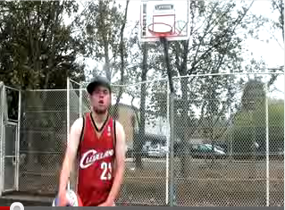
For our magazine advert we are going to use similar colours and tones to the ones in the music video.
The most common colours we use in the video are Red, Black, Blue, White and Grey We decided that because these were the most common colours in our music video, we would use these for our digipack. We may use an image like the above one with Steve holding the Basketball wearing the Red and Black vest top. This means we are going to take similar colours out to use for our text and symbols etc.
For our magazine advert we are going to use similar colours and tones to the ones in the music video.
The most common colours we use in the video are Red, Black, Blue, White and Grey We decided that because these were the most common colours in our music video, we would use these for our digipack. We may use an image like the above one with Steve holding the Basketball wearing the Red and Black vest top. This means we are going to take similar colours out to use for our text and symbols etc.
Real Magazine Advert
 This is a great example of a professional magazine advert which is of a more related genre to our genre of music. Obviously this theme is of glamour and uses a lot more colour than the student advert that I analysed. You can see because Cee Lo Green is a solo artist, they have used a close up of him to make the artist instantly recognisable when the advert is seen. This means that the title of the artist is less important, and consequently does not have to be at the top of the page. The bottom third of the page then tells us the information we need and it follows the conventions used in the student ad:
 1 -Artist
2 -Title
3 -Date
4 -Reviews
5 -Website/Record Labels
2 -Title
3 -Date
4 -Reviews
5 -Website/Record Labels
You can see that the editing and colours used help this advert stand out from the page. They have used very strong, vibrant colours (perhaps to link with the genre of pop/soul/rap) with the writing and background, as well as using strong bright lighting in the phot to reflect of his jewellery.
Again this is a very simple advert that is instantly effective and memorable. It is very useful to see how different genres are shown through the adverts and this real ad will definitely aid our designing and editing for our magazine ad and digipak.
Previous Student Magazine Advert

You notice that the title of the artist and song name are at the top, as this will be the first thing that the audience will read. The next most important piece of information on the advert is the date of release and where it can be brought from. Therefore it was important this was placed near the top, under the title so that it can be read easily. The more "unimportant" pieces of information have then been placed below, such as the reviews and record labels etc. These pieces of information will probably be read by the audiences who are interested in the band and want to find out more information to see if it's worth buying.
Overall, this is a perfect example of a simple but effective magazine advert. We could use the idea of a location from our video in the magazine advert, however because this is by a band it may not be as necessary to visually show the faces of the band. Because our song is done by one artist and is a different genre to this, it may be more sensible to show the audiences who "Kyle Rapps" is. We can definitely take some good ideas of how to position texts in the magazine ad though.
Subscribe to:
Posts (Atom)